At 80: A Retrospective
Thursday, 16 July, - Sunday, 27 September, 2020
-
Overview
-
Works
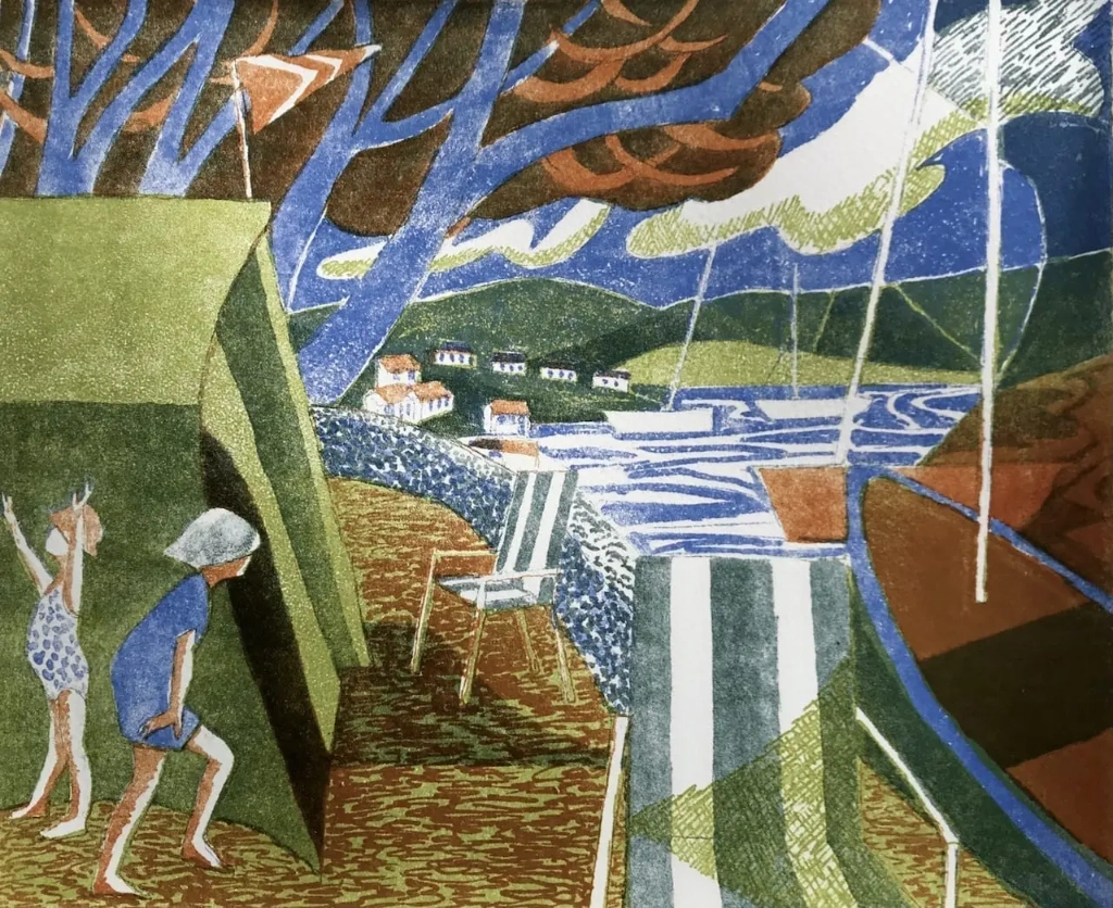
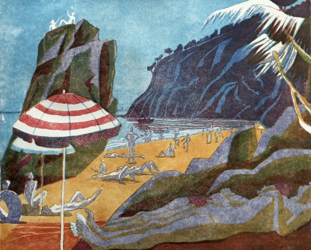
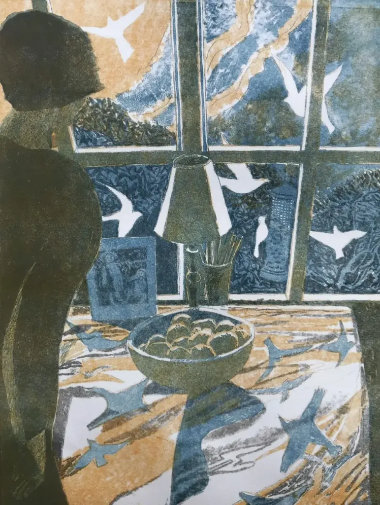
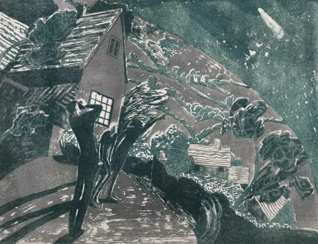
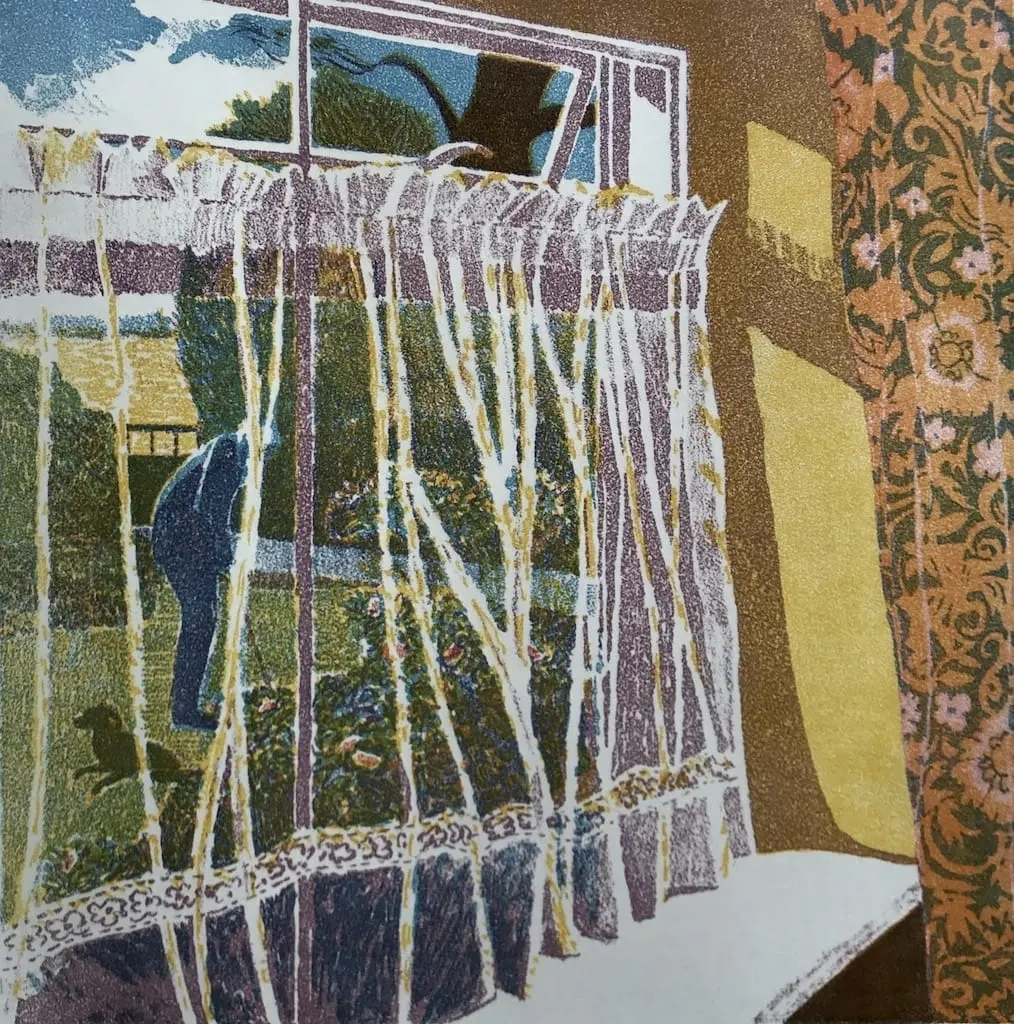
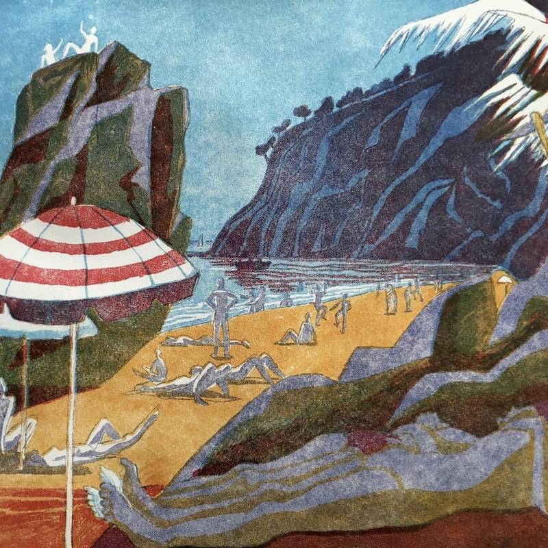
Mostly it is about placing one colour beside another, one shape against another. Finding a subject is really an excuse for that. I like John Updike's "to give the mundane its beautiful due" and Carol Ann Duffy's wish "to transcend the ordinary". Then there is The Moment. I am very interested in the moment as some sort of unexpected unlooked for coming together of things in an affirmation. This can be expressed by a lovely pure colour, and the indifferent dull old world by some dark colour that gives the context, sometimes almost overwhelming it. I love the economy, the limitations of the print. More and more I like duality and paradox and using contrasting colours in juxtaposition.
I work on a Victorian Gothic press using limestone blocks in the traditional way. My work is limited by the size of the stones. The lithographic medium is based on the antitheses of grease and water. I draw on the porous stone with grease - either in liquid form or in a stick of chalk. After proofing with gum Arabic and nitric acid the stone is ready to for the press. Providing the stone is kept wet, the greasy drawing will attract the greasy ink and the wet surface will repel it. The original drawing grease (usually black) is now removed and the image inked up in whatever colour is required. I almost always use three or four colours to build up a print. The buzz comes with superimposing one transparent colour over another. The small crosses, top and bottom, enable accurate registration, one colour over the previous one.